color

Chronophoto Is A Fun Game Where You Guess The Age Of Photographs

Chronophoto

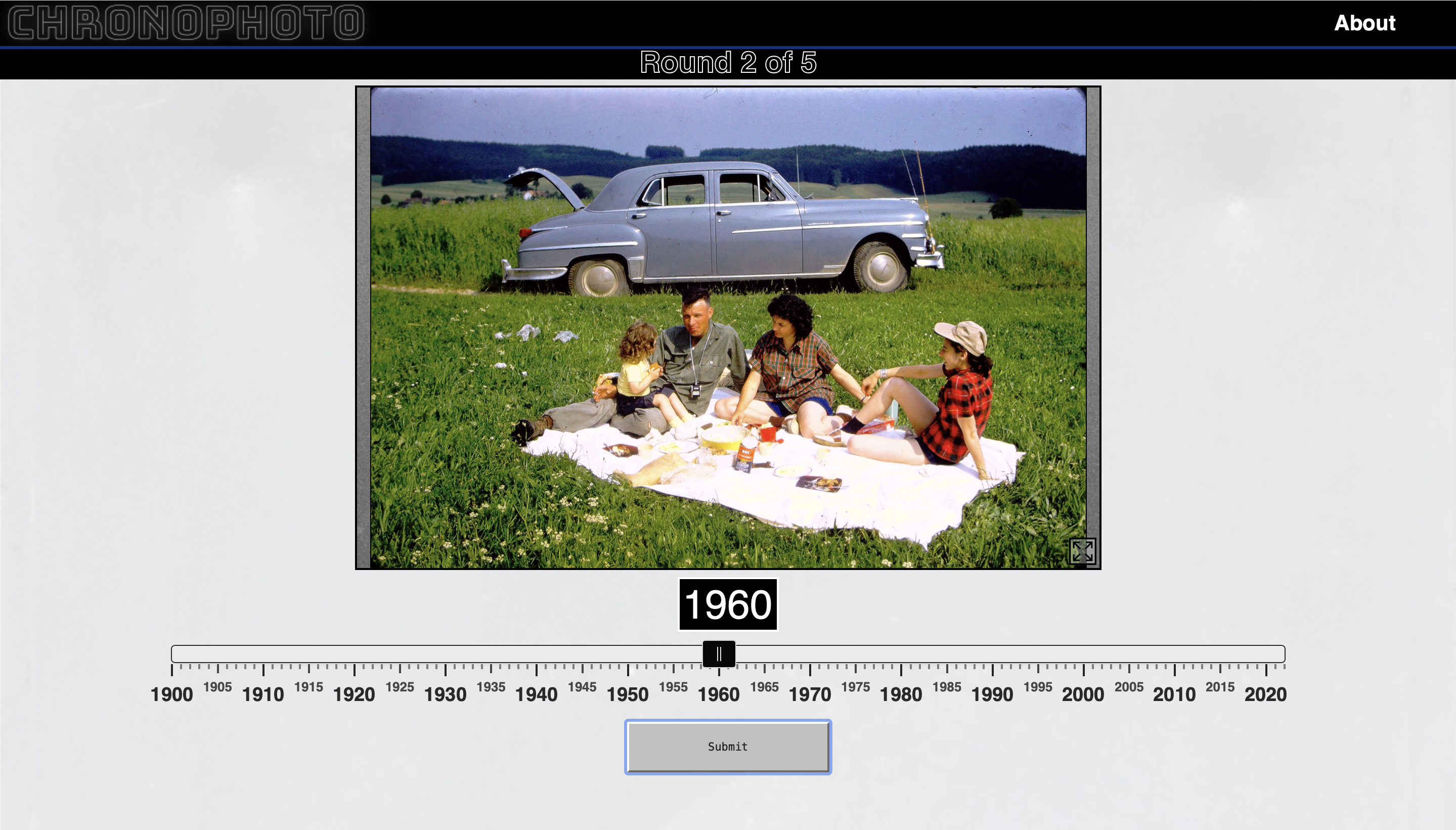
I thoroughly enjoyed playing a few rounds of Chronophoto. It’s is a game in which you guess the dates of five historical photographs. The more accurate your guess, the higher your score. Each photograph has its own set of clues that give away the era — film quality, subject matter, products, uniforms, fashion, vehicles, and colorization,

My scores are all over the board, but after about 5 rounds I got a high score of 3,315. When I was wrong, I was really wrong. I did get a couple of guesses right on the spot – resulting in 1,000 points each – but being wrong is almost more interesting.

Noteworthy Tumblr #4: Pretty Colors

Pretty Colors is exactly what it says on the tin: a tumblr filled with pretty colors. Currently there are nearly 10,800 pretty colors posted. Under our current system only 16,777,216 colors that can be represented on the web. Given that Pretty Colors doesn’t repeat a color (which I already know they have – color #7900BC has been repeated at least 12 times already) and that it continues posting at about the same rate (which isn’t even close to consistent), the tumblr should be around for about another 1,830 years before it runs out of colors.

#30FFB1
Photo credit: Pretty Colors

Additionally, the archive is pretty to look at too. Of course, a properly calibrated screen will be needed to bring across each color’s true prettiness.

Colorful/Super Moon


Photo credit: Noel Carboni

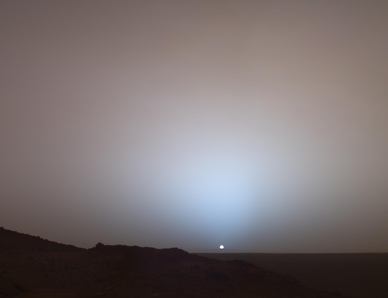
The image above, click it for a wallpaper sized version, is a composite of 15 exposures digitally stitched together. According to photographer Noel Carboni:

Looking through the viewfinder I swept across the surface in a zig-zag fashion, trying for about 1/3 overlap between frames. I triggered the shutter with my TC80-N3 remote timer/controller. I did the stitching by hand in Photoshop.

Since it was taken at the camera’s most noise-free setting (ISO 100), the data is very accurate, and thus I was able to strongly increase the saturation via Photoshop’s Image – Adjust – Hue/Saturation function.

The fascinating color differences along the lunar surface are real, though highly exaggerated, corresponding to regions with different chemical compositions. And while these color differences are not visible to the eye even with a telescope, moon watchers can still see a dramatic lunar presentation tonight thanks to a fluke of orbital mechanics that brings the moon closer to Earth than that it has been in more than 18 years. At its peak, the supermoon of March 2011 may appear 14 percent larger and 30 percent brighter than lesser full moons. However, to the casual observer, it will probably be hard to tell the difference.
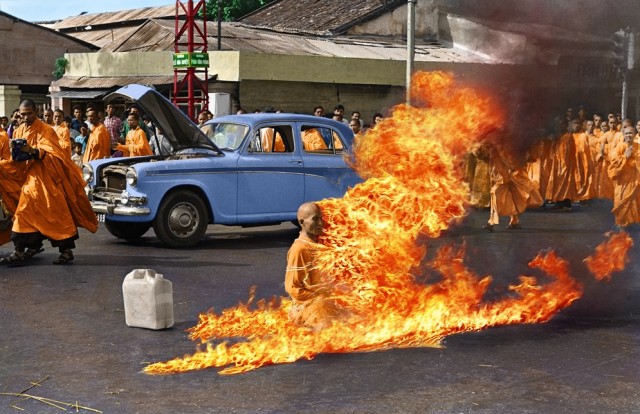
Colorized Version Of Burning Monk Thích Quảng Đức

Burning Monk Thích Quảng Đức
Image courtesy of mygrapefruit

When I first saw this colorized version of Malcolm Browne’s iconic image I didn’t realize it was digitally enhanced. My mind’s eye has always seen this image in color for some reason.
Mygrapefruit has done a great job adding to the photograph without taking away its ability to be beautiful, horrifying, and extremely moving.

Kaleidoscopic Microscopic Photos Of Booze

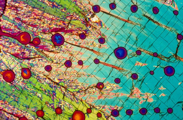
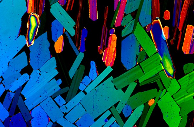
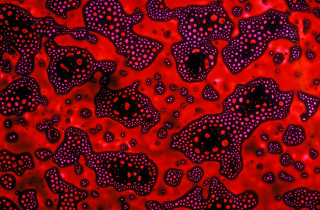
These kaleidoscopic images are micrographs of alcoholic beverages collected by Florida State University. The images are made by crystallizing the cocktail or beer or wine on a lab slide, then passing polarized light through the crystal and magnifying it over 1000 times. As the light refracts through the beverage crystals, the resulting photos have naturally magnificent colors and composition.

Vodka
Tequila
Black & TanYou can purchase high-resolution large-scale print of these boozy closeups at Bevshots. There are a lot more photos below as well. Just hold you mouse pointer over the picture to find out what kind of beverage it is.

Scroll to Top