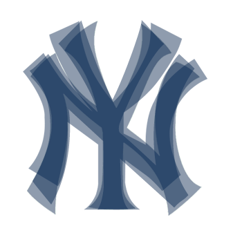
Craig Robinson pointed out over at his website Flipflopball that there are at least four different versions of the of the Yankee’s “NY” logo in use. One for print, one for the cap, one for the batting helmet, and another for the home jersey.
Here I have resized three of those logos so that the Y is the same height on each of them. I couldn’t find a good quality image of the batting helmet “NY” so rather than approximate, I’ve left it out. This is what a composite of the three logos looks like.


porque tiene que ser diferente en los tres implementos de los jugadores??? no entiendo