Introducing The Quentin Blake Typeface
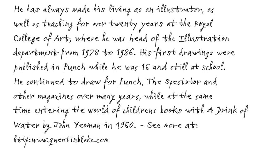
If you have ever read a children’s book illustrated by Sir Quentin Blake, you are probably familiar with Blake’s playful and original handwriting style. The folks at Monotype were tasked with creating a typeface that replicated the unique form of Blake’s writing in an authentic and natural way.
Monotype’s solution included using four subtly different variants of each letter that was selected from a large collection of writing samples. The variants allow for the typeface to seem to have random alterations and diversity among the letters, making it appear more like handwriting. The result is a typeface that doesn’t just look like Sir Quentin Blake’s writing, it acts like it too.
via Kottke

