font

Maps of Dune

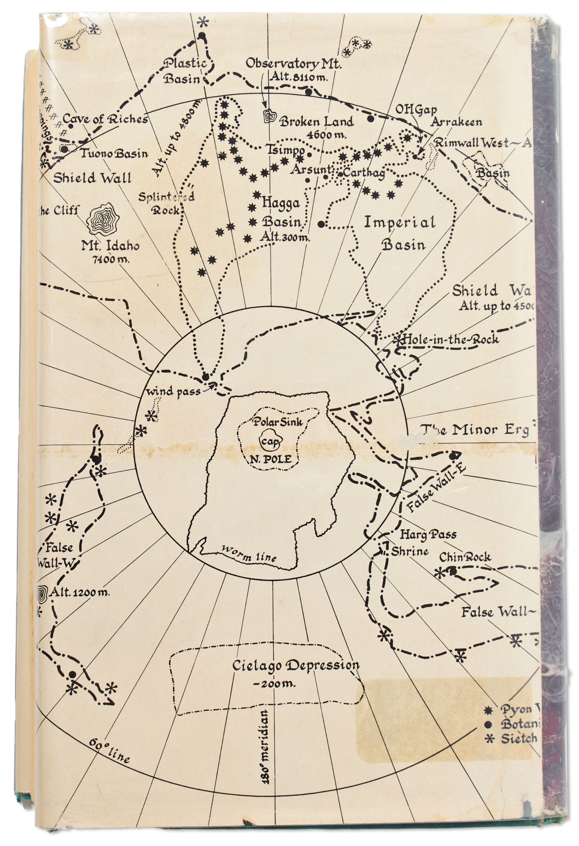
The First edition, first printing of the science fiction classic “Dune” by Frank Herbert has an unusual map of the stories setting printed on the dust jacket. The linked edition had an opening bid of $6,500 but didn’t sell. I haven’t yet read (or watched) Dune but I’m posting this here for when I do.

Dune map

ht: Nelson Minar

After posting this at reddit I was pointed toward these:

See also: The Most Accurate Maps Of Panem

Introducing The Quentin Blake Typeface

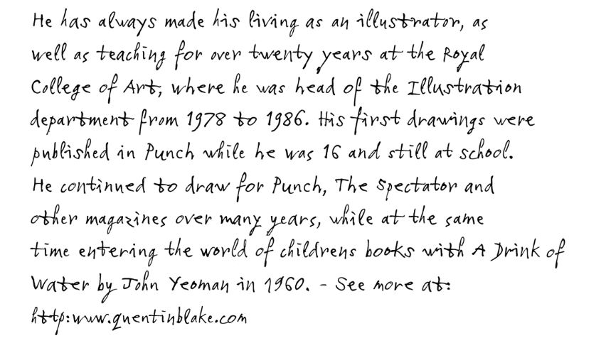
If you have ever read a children’s book illustrated by Sir Quentin Blake, you are probably familiar with Blake’s playful and original handwriting style. The folks at Monotype were tasked with creating a typeface that replicated the unique form of Blake’s writing in an authentic and natural way.

Monotype’s solution included using four subtly different variants of each letter that was selected from a large collection of writing samples. The variants allow for the typeface to seem to have random alterations and diversity among the letters, making it appear more like handwriting. The result is a typeface that doesn’t just look like Sir Quentin Blake’s writing, it acts like it too.

Quentin Blake Typeface

via Kottke

Raclette

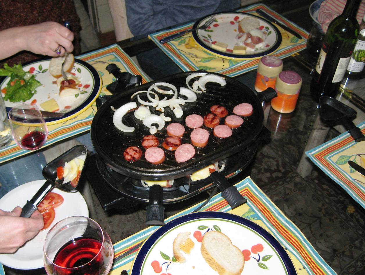
The blizzard of oh-six has been more fun for me than hassle. We were finally able to get the cars dug out yesterday after three long days of being stuck and serious shoveling by both G and myself. The storm allowed me a few snow days from work that were rather lazily spent. On Wednesday night a few nearby friends braved the accumulating drifts and headed over to our house for Raclette. I had never had Raclette before and it’s wonderful, perfect for a cold snowy evening stuck indoors. How can you go wrong with cheese, sausage, potatoes, and onion? Yummmmm.

[ad name=”Extra Long Post Footer Ad w/ Large Font”]

Scroll to Top